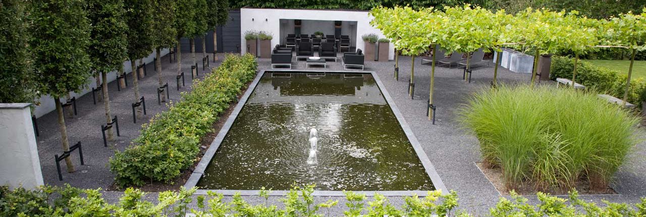
Simplicity is an important starting point in Martin Veltkamp’s gardens. However, this concept does not have anything to do with the word ‘simple’. Simplicity is about modesty, it is about doing without and it is about the ingenuous.
Martin Veltkamp designs gardens where simplicity is a type of minimalism, without making concessions for comfort and luxury. Everything in the design has a clear goal. A few large pots with identical plants can give a sense of direction, for example. The lines in the garden follow the shapes of the straight and angular façade of the property. These surfaces are in proportion to the volume of the house. In a well-designed garden, lines are created by choosing many of the same plants and planting trees in a line to provide a sense of direction. These effects are enhanced with ton-sur-ton colour arrangements. The use of colour is limited to grey, anthracite or white, as well as earth tones or beautifully ribbed wood to add the necessary texture and warmth. This way a refined image is created.
Besides limiting the use of colour, Martin Veltkamp prefers not to use too many different materials. It is by especially by combining simplicity of landscaping with luxurious elements in garden furnishing that the essence of purity comes to life. However, a change in function needs a change in material. If a patio (where people don’t move) is made of tile, a garden path can be made of gravel. Clarity in use of materials provides satisfying coherence. Concrete may be seen and the wood of a fence is left unstained. This search for simplicity in no way leads to frugality or discomfort. A minimalist, grey granite bench gets dressed with comfy, black pillows, for example. The final result will be casual, yet luxurious.

